Sandbox
Hello! Welcome to the evolving “messy middle” of my UI/UX journey. Here, I take you through a project from conception to final execution, sharing the process, challenges, and insights I gather along the way every week. Enjoy your stay in my creative journal as you see how I learn and refine my craft 😊.
Project Brief
To create a brand and an all-in-one social planning app that combines calendars, group messaging, and encourages in-person group socialising.
Jump to
Phase 1 – Research and discovery
- Define user personas and pain points
- Competitors
- Core features
Phase 2 – Ideation & Structure
- Defining the user flow
- Wireframe sketches
- Low-fidelity wireframes
- Logo design
- Colour palette
- Tagline
Phase 4 – Design & Prototyping
- Onboarding, plan creation, and calendar views
- Interactive mid-fidelity prototype
- Visual style and design system
- High-fidelity mockups
Phase 5 – Testing & Refinement
- Prepare a polished prototype and UI kit
- Conduct usability testing (if possible, with peers or online)
- Analysis and usability issues
- Refine designs based on insights
Phase 6 – Presentation & Documentation
- Walkthrough video/clickable demo
- Case study explaining the design process
- Visuals for each phase (journey maps, wireframes, mockups)
- Final presentation
Phase 1
Research and Discovery
Define user personas and pain points
My friends and I jump through many hoops to arrange a hangout every month or two. And because we are a large group with busy lives, it can get quite tough to organise. Using multiple apps for discussing, creating polls for a date and time, sharing loads of external links, and using an obscure website to select when we can do a date can be very tedious. Even just reading what I described induces stress. I had the idea to design an app to consolidate all of this, something I can and want to use with my friends. And so ‘canu’ was born.
Where did the name come from? Like a canoe, it represents a lightweight, streamlined experience; an intuitive and simple user flow to create events on your own or with other users.
Tools
- Figma
- Adobe Illustrator
- material.io
Competitors
Google Calendar, Doodle, When2meet, Howbout, Plan Pop, Time Tree.
Core features
- A social calendar where users can see others’ availability,
- Create and collaborate on events with other users,
- View events made by others; easily participate and invite others,
- Chat with other users.
…and many more that I am sure will come as “great” ideas, or in a panic as essential and probably obvious.
Phase 2
Ideation and structure
Wireframe sketches and notes
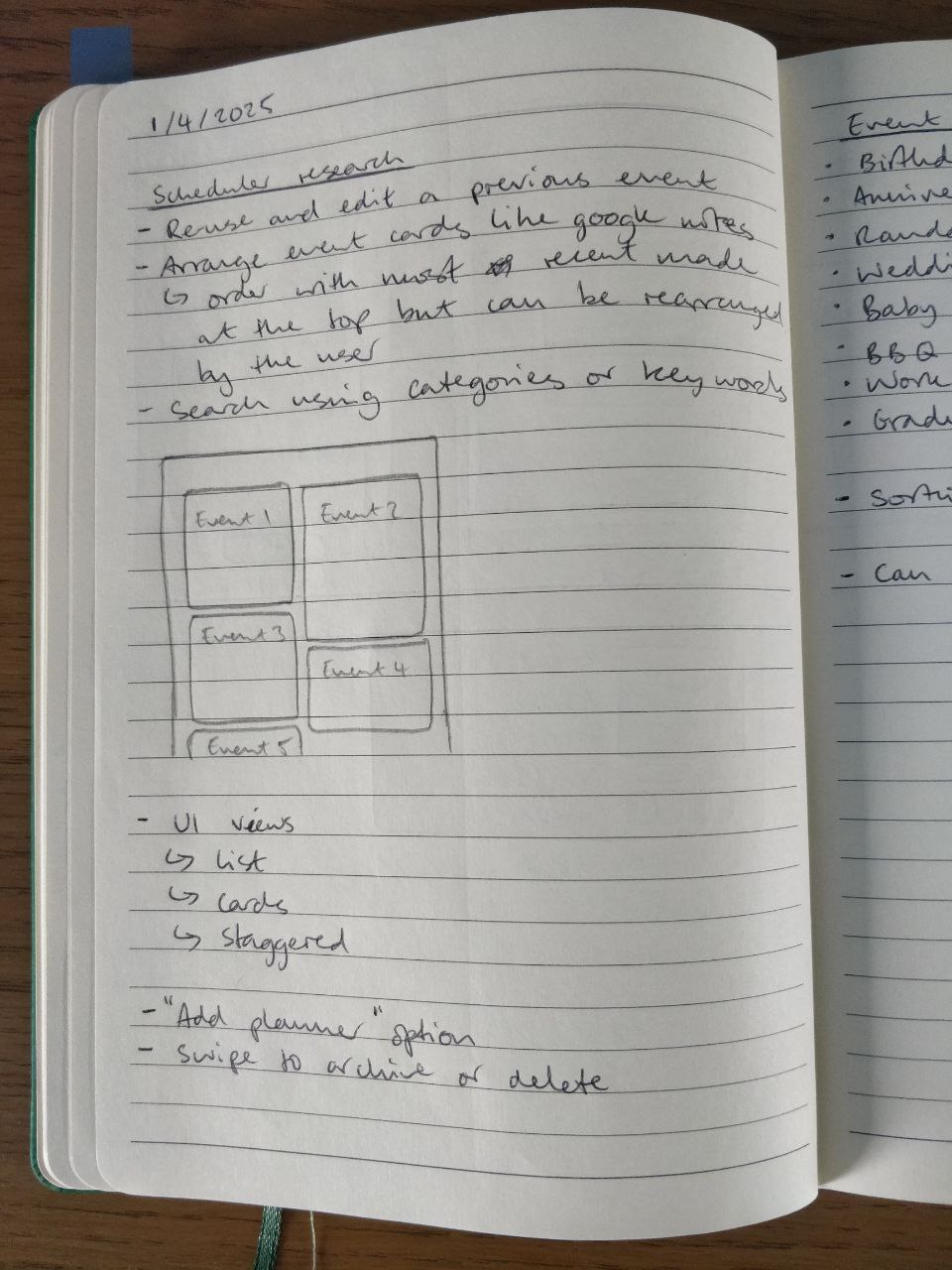
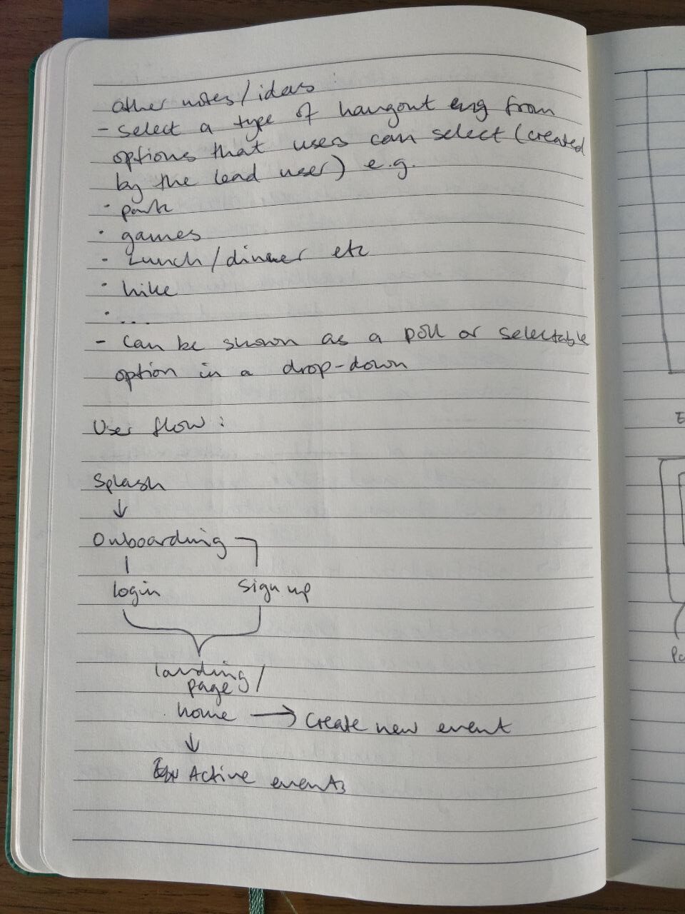
Defining the user flow
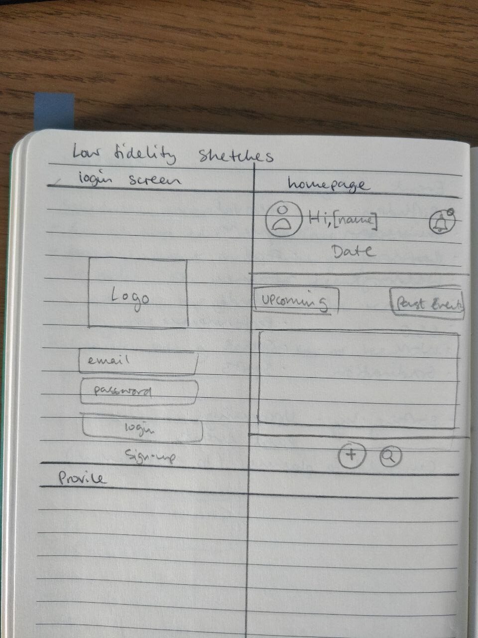
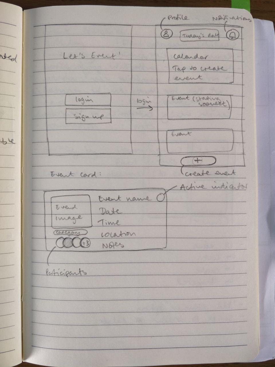
Low-fidelity wireframes
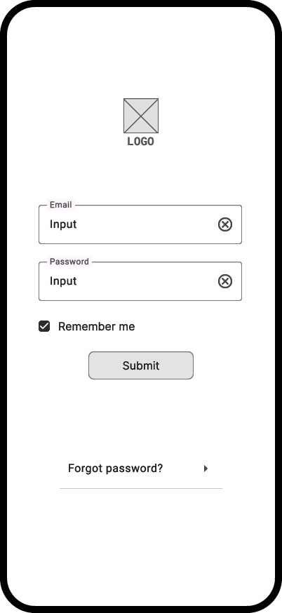
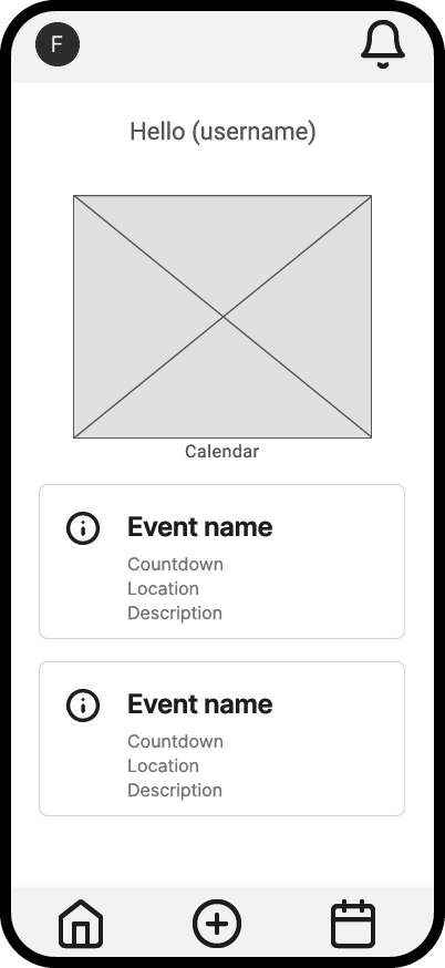
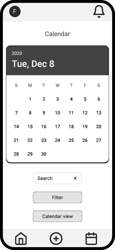
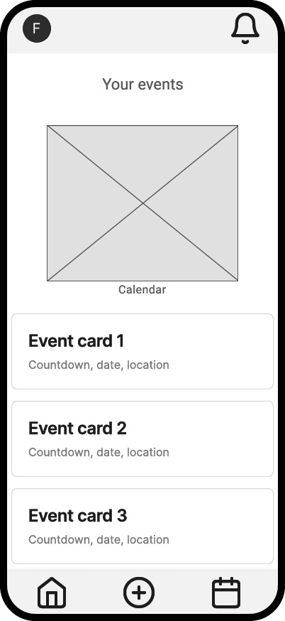
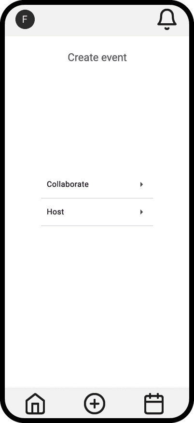
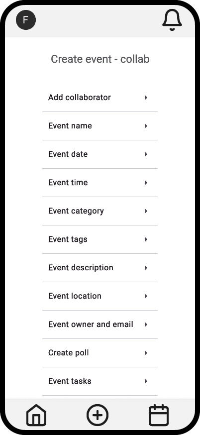
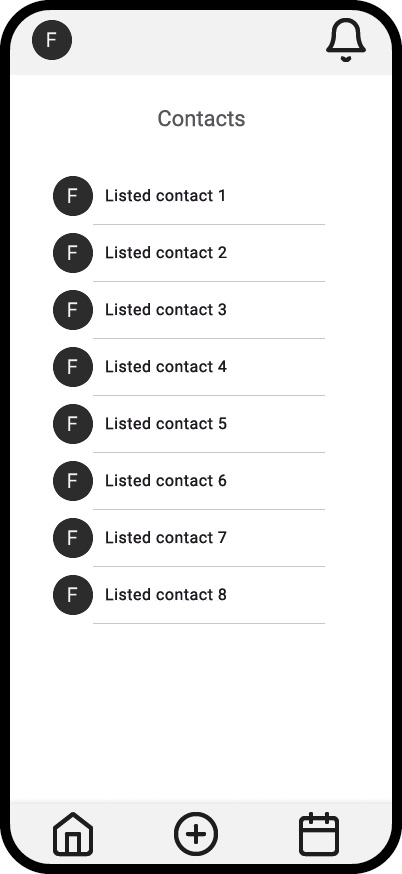
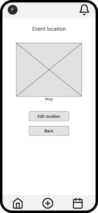
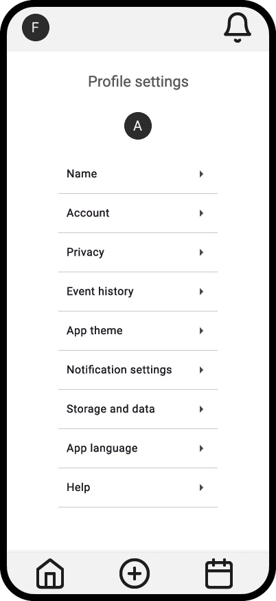
Some examples of key screens based on the user flow. These lo-fi wireframes were created in Figma. I’m presenting the second iteration of these lo-fi screens after making some adjustments to the top and bottom navigation menus, which have been simplified. A feature which I am carefully considering for its placement is the messenger. I’ve noticed that when using mobile apps, they typically have 3 or 5 destinations on their bottom nav bar. Although there are existing apps that present 4 destinations, they are less common.
Sometimes, apps will have a “more” button to get the number of destinations to reach 5. Realising this has made me think that adding the messenger button to make it 4 destinations may make it look a little awkward. I will experiment with its placement before finalising, as having the messenger as a core feature hidden in the profile screen is inconvenient and goes against the philosophy of being intuitive.
Icons should ideally be paired with text labels for immediate destination descriptions. It also means the user will have to do less work to decipher what the icons could mean, further improving accessibility and intuitiveness. This will be added to the next iteration.
Phase 3
Branding
Logo concept sketches
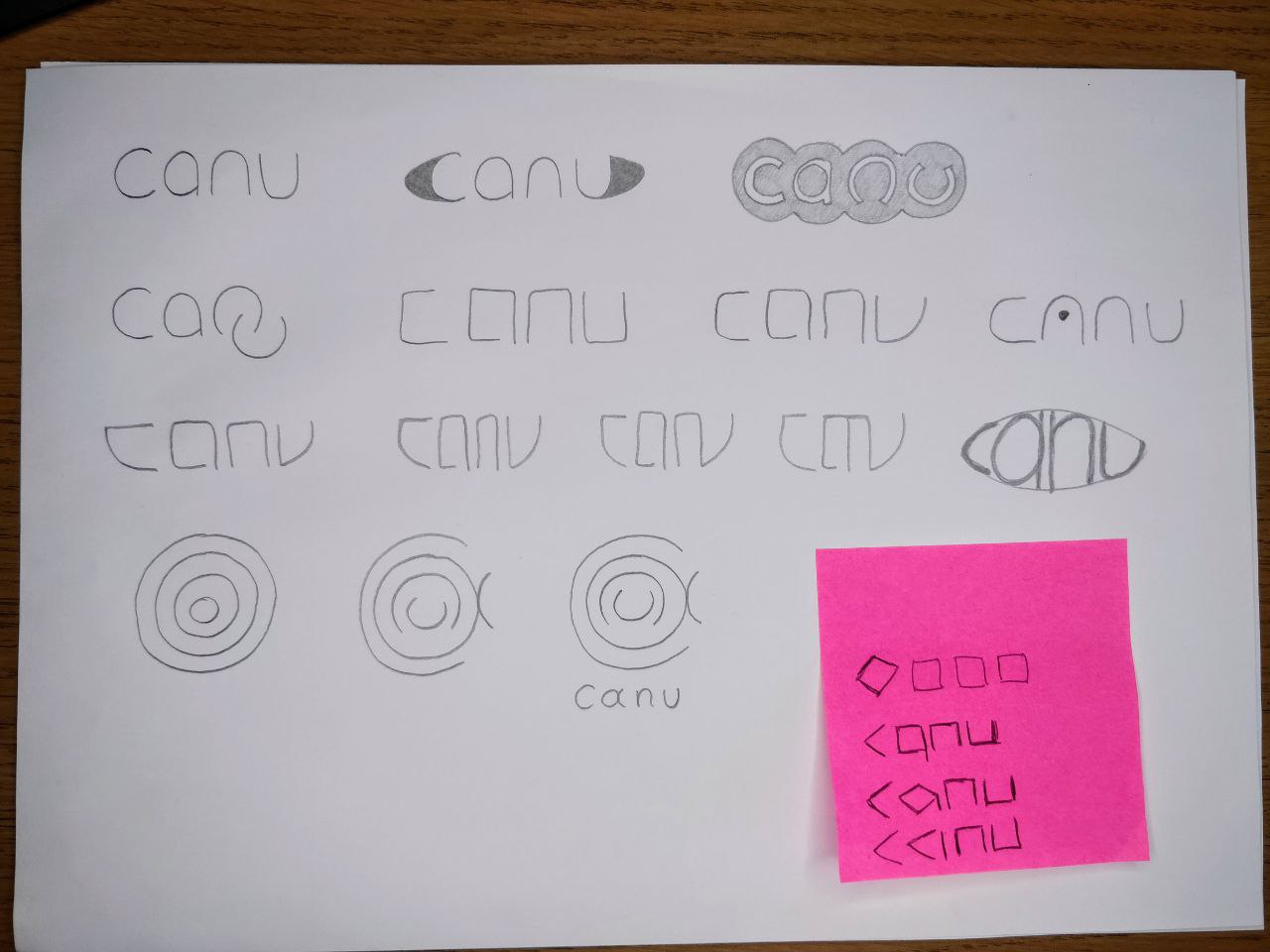
Concept 1
From the sketches I created, I was keen to expand on the idea of the letters being nested in one another, like Matryoshka dolls (Russian dolls). I used four colours here and applied a gradient effect to merge the ‘c’ and the ‘a’. I placed the wordmark underneath with the ‘a’ tweaked to resemble that of the emblem.
Concept 2
I was quite drawn to the ‘n’ and the ‘u’ shapes in the first concept, and decided to expand further on it. I experimented with making all the letters the same or similar shape, where I took cues from the curves and the angles where the letters end. I applied a thick stroke around the entire logo with a gradient, using the same four colours as the first concept. I also rounded the corners to make the logo appear friendlier.
Concept 3
I tested the readability of concept 2 to a group, and the feedback was that the ‘n’ was difficult to decipher. This informed the latest concept, where the ‘n’ looks more conventional, and the ‘a’ has a dot in the centre to distinguish it from looking like an ‘o’. The number of colours in the gradient has been reduced from four to three, with their positioning adjusted.
The feedback was positive from the majority of participants, who were able to read the logo correctly. However, some tweaks to the ‘a’ could be made, as it may not be so accessible, especially to a neurodivergent audience.
Colour palette

91, 79, 62, 97

0, 0, 0, 0

5, 98, 69, 1

0, 62, 68, 0

74, 70, 0, 0
I chose a couple of warm tones and paired them with a cooler colour for a fun and inviting feel. These were used for the logo in concept 3.
Tagline
To create a strong tagline, I had to restate the app’s purpose: event creation, collaboration, and a streamlined experience. I wanted to link the collaborative aspect with a hint at the app name origin.
Shortlisted Taglines
- Streamline your events
- Plan in perfect sync
- Easy event flow
- Event plan in tandem
- Events steered on course
- Keeping your events afloat
Standout choice: Plan in Perfect Sync
Phase 4
Designing and Prototyping
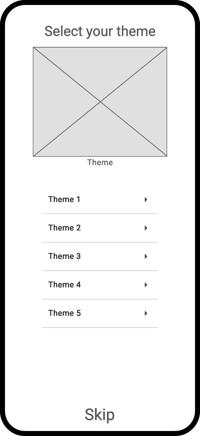
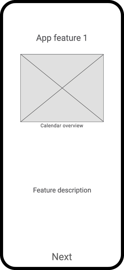
Onboarding
Onboarding is the process of helping new users understand a product’s value. As well as getting customers to understand the app features and making the interface intuitive, onboarding is an important step to keeping users actively using it.
The ideal onboarding process to retain new users:
- A seamless sign-up process,
- Provide clear and concise instructions and provide skip/revisit later sections,
- An onboarding checklist of action items,
- A structured and organised framework,
- Collecting and analysing user feedback,
- A breakdown of larger, complex processes into smaller, manageable tasks.
The 6 core elements that can utilise the product onboarding process
Canu introduces special features that other calendar apps don’t have, so onboarding is important to familiarise users with Canu’s USP.
1. Knowledge bases
- New users and customers can access information regarding Canu.
- They must be easily found and accessible 24/7.
- The information should be categorised and displayed in a simple design with a search bar.
2. Creating intuitive user interfaces
- Following proven design conventions to ensure instant intuitiveness and familiarity.
- Prioritising visual hierarchy by making important elements larger, bolder, or more colourful.
- The language must be consistent and concise to prevent any ambiguity.
- Visual cues such as icons, tooltips, or micro-interactions indicate how elements work.
I’m interested in implementing tooltips into Canu, which are interactive elements that appear within the user interface next to an action or feature to guide users without overwhelming them during navigation.
I’m looking into incorporating them as a GIF, a to-the-point copy, or a skip option. They can also offer contextual onboarding to communicate updates and new features, surveys, and reminders.
3. Reducing cognitive load
- Limiting to only essential information, and the rest is an option for more detail.
- Progressive disclosure, which reveals advanced options only when needed.
- Simplifying tasks to break down complex processes into smaller steps.
- Providing clear feedback gives users immediate confirmation of their actions.
4. Increasing the role of visual design
- Using visuals to convey information, e.g, icons.
- Creating a visually appealing interface using a consistent colour palette and typography.
- Enhancing usability with visual cues by using colour and spacing to differentiate clickable elements from non-clickable ones.
5. Providing effective onboarding
- Identifying user goals.
- Creating a clear onboarding path by using tooltips, walkthroughs, or interactive tutorials.
6. Product tours
- An in-app tutorial to encourage customers to engage with the product.
- Simple and easy to follow call to actions.
- Skip options.
| Onboarding mistakes to avoid | Onboarding best practices |
|---|---|
| Making users jump through hoops to sign up | Prioritise a frictionless sign-up process to avoid overwhelming the user |
| Abandoning confused users when they require assistance | Establish a structured onboarding process |
| Making users guess how to use your product due to the absence of contextual onboarding | Collect and analyse user feedback |
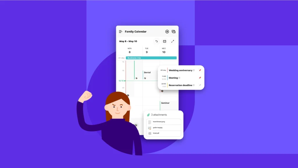
Calendar views
Canu is centred around the calendar. It needs to be clean and intuitive, but should feature some extras to entice users to stick around.
To ensure Canu can be considered a strong contender, I have researched the leading calendar apps to see what makes them a staple for users.
Case studies for a complete mobile calendar app
| Google Calendar | Apple Calendar | Microsoft Outlook Calendar |
|---|---|---|
| Excellent integration | Intuitive, clutter-free interface | Strong team collaboration tools and shared scheduling |
| Detailed individual screens | Free for Apple users | Intuitive calendar ui design with flexible views |
| Calendar multiview | Effortless syncing within the Apple ecosystem | Smooth integration with Microsoft 365 tools |
Source: www.idownloadblog.com
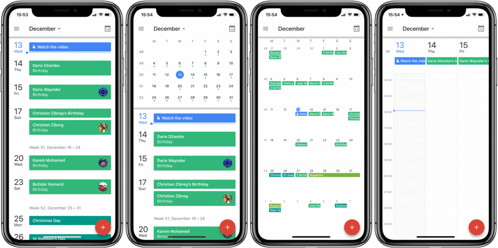
I’ve used Google Calendar as a reference (see image above), and these case studies show that users want a simple interface where the extra options are available without being shoved in their face. The basic features are free to use and are well integrated with other prominent apps. It needs to “just work”!
Case studies for a collaboration-focused mobile calendar app
Below is a brief overview of my competitors:
| Calendar.com | Teamup Calendar | Time Tree |
|---|---|---|
| Smart scheduling tools for faster planning | Excellent for managing shared calendars and team projects | Real-time event sharing with easy editing |
| Time analytics to track productivity | Highly customisable with sub-calendars and colour-coded events | Intuitive interface with colour-coded schedules |
| Strong team collaboration tools and shared scheduling | Simple, intuitive calendar UI design that scales for different needs | Ideal for families and friend groups |
Source: www.timetreeapp.com
For collaboration, real-time event creation is a big draw for users in friend groups and families. It gives a sense of inclusion and excitement.
Calendar features to implement in Canu
Upon my research of the great features that my competitors have, I see gaps that Canu can fill and stand out from the crowd.
| Basic features | Unique features |
|---|---|
| Multi-view display options: day/week/month, through mobile gestures | Weather forecast for the day/week |
| Colour codes and tags to categorise, prioritise, and organise | Insights for time spent per category/another user |
| Clear and legible fonts | Past event memories |
| Microinteractions, responsive and snappy for satisfying feedback | Including gaps/breaks within an event instead of creating multiple events in a day |
| Event creation, recurring events, and management | Multiple locations within an event |
| Calendar syncing and sharing | Calendar comparisons |
| Connectivity with other productive tools | Smart suggestions: best time based on contact(s) availability |
| Search and filters | Templates for repeated events |
| Free to use | Highlight/suggest available frequently invited users for a planned event date and time |
Summary
Based on my research, onboarding is an early decider whether a new user continues using a mobile app or drops off. Competition is extremely fierce, and new customers hold no loyalty. Their time and privacy need to be respected; therefore, successful onboarding should be a fast, structured process where users are introduced to key features quickly. This allows them to see the value of the app and thus potentially become a regular customer.
As the calendar is integral to Canu, all the key features listed above will be implemented. The calendar needs to be intuitive, versatile, and familiar, and that familiarity will come from the proven design conventions that are found in the leading calendar apps. With a simple design, users can navigate with ease, and a dedicated help centre resolves any confusion. The unique calendar features make the mobile app stand out and increase the app’s value.
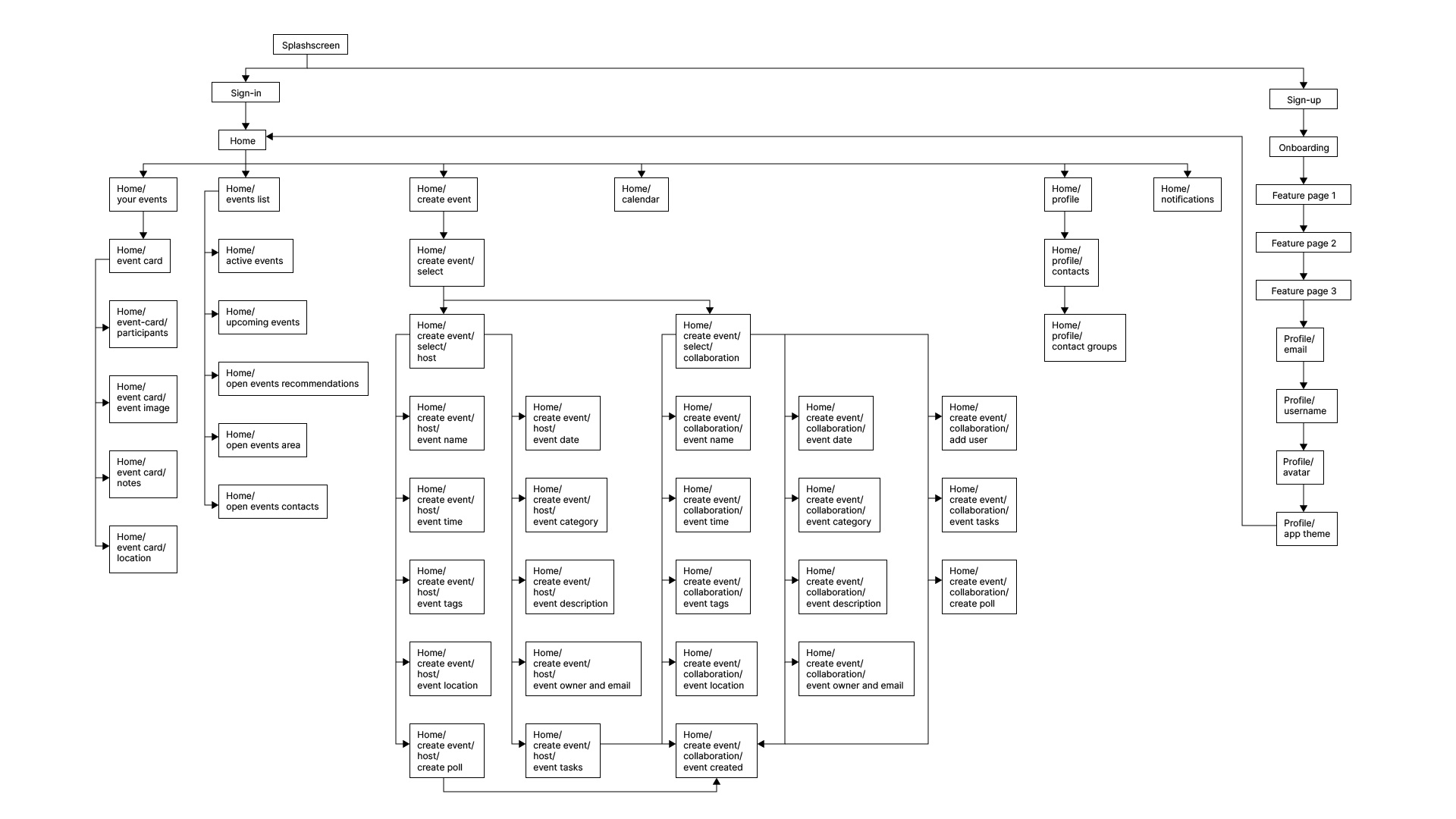
Mid-fidelity prototype
I created a functional prototype highlighting the screen transitions and key element placements. Once finalised, it will inform me how and where I can implement the unique app features.
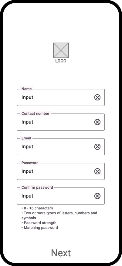
Flow 1: sign-up for first-time users.
Flow 2: Login to homepage and tour of basic features.